

Website Redesign Matters: 5 Ways to Tell if Your Small Business Site is Holding You Back
Let’s be real for a second: looking at your own website can sometimes feel like looking at an old high school yearbook photo. You know the one. The hair was choice, the outfit was... experimental, and while it felt "correct" at the time, looking at it now just makes you want to crawl into a hole.
We’ve all been there. In fact, even after 35+ years in this game, we still get that occasional twinge of "is this still us?" It’s a totally normal, albeit slightly annoying, existential crisis. But when that feeling starts happening every time you send a link to a potential lead, it’s not just a mood: it’s a business problem.
For small business owners: especially the powerhouse women-owned and minority-owned brands, authors, and publicists we love to work with: your website is often the first "handshake" you have with the world. If that handshake is limp, outdated, or just plain confusing, you’re leaving money, impact, and opportunities on the table.
A website redesign isn't just about making things "pretty" (though we do love a whimsical, gorgeous aesthetic). It’s about alignment. It’s about making sure your digital home actually reflects the powerhouse business you’ve built in the real world.
So, how do you know if it’s time to scrap the old and embrace the new? Here are five signs your site is currently acting as a handbrake on your growth.
1. The "Visual Vibe Check" Fails (It Looks Outdated)
First impressions are formed in about 0.05 seconds. That’s faster than you can say "fucking genius." If your site looks like it was built during the peak of the "blogging for fun" era, people will subconsciously assume your services are just as dated.
We’re talking about cluttered layouts, weirdly small fonts, and those generic stock photos of people in suits shaking hands. (Seriously, who does that anymore?) For authors and publicists, your brand identity is everything. If your site doesn't scream "authority" and "creativity," why would a publisher or a high-end client take you seriously?
At That One Couple, we believe in a brand identity design that feels timeless but fresh. If your visual language doesn't spark joy or command respect, it’s time to pivot.

2. The Mobile Experience is a Total Nightmare
We’re living in 2026. If a user has to "pinch and zoom" to read your bio or find your contact form, you’ve already lost them.
Most of your traffic is likely coming from someone scrolling on their phone while waiting for coffee or sitting in a meeting that could have been an email. If your site doesn't flow seamlessly on a smartphone, Google is going to punish your rankings, and your users are going to bounce faster than a rubber ball.
A modern website design for small business must be mobile-first. This isn't just a technical "nice-to-have"; it’s an accessibility issue. We want your site to be a welcoming space for everyone, regardless of what device they’re using. If it feels clunky on mobile, it’s a giant "Keep Out" sign for your audience.
3. You’re Getting Traffic, But Nobody’s "Buying"
This is the ultimate frustration. You check your analytics, and people are showing up. They’re clicking. They’re browsing. But then... silence. No emails, no book purchases, no consultation bookings.
This usually points to a breakdown in User Experience (UX). Maybe your "Contact" button is hidden. Maybe your messaging is so vague that people don't actually know what you do. Or maybe the "path to purchase" is so complicated it feels like trying to solve a Rubik's cube in the dark.
When we talk about the creative process, we focus heavily on the "Why." Why should someone click this? Why does this matter to them? If your site doesn't answer those questions immediately, a redesign can help clarify your mission and turn those "lurkers" into "leads."
4. It Loads at the Speed of a Snail on Vacation
We’ve all become incredibly impatient. If your site takes more than three seconds to load, your bounce rate is going to skyrocket. Slow load times are often caused by unoptimized images, messy code, or outdated hosting.
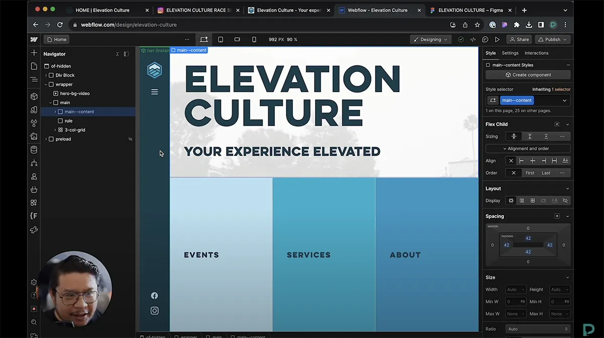
This is one of the reasons we are such big fans of Webflow. It allows us to build high-performance sites that are clean, fast, and incredibly stable. Beyond just the speed, we want to give you tools for independence. We don't believe in the "churn and burn" model where you have to call us every time you want to change a comma. We build sites that you can actually own and manage.
(Insert GIF description: A retro computer being thrown out of a window in slow motion.)
5. Your Business Has Outgrown Your Site
This is the most common reason our favorite clients: minority-owned businesses and creative entrepreneurs: come to us. You started your business three years ago with a DIY template. It worked! It got you off the ground.
But now? You’ve scaled. You’ve refined your voice. You’ve landed bigger projects (maybe even something as cool as Close CRM or Sabrina Jeffries). Your current site feels like a suit that’s two sizes too small. It’s tight, it’s uncomfortable, and it’s stopping you from moving freely.
If you find yourself saying, "Don't look at my website, it’s under construction" (even when it’s not), that’s a massive red flag. Your website should be something you’re proud to show your work on.

The "That One Couple" Way: Collaboration Over Churn
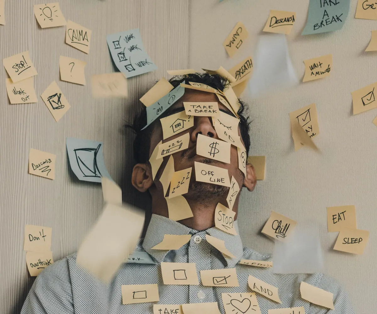
We get it. The idea of a website redesign can feel overwhelming. It feels like a mountain you’re not quite ready to climb. You might even be feeling a bit of that "imposter syndrome": wondering if you’re "big enough" to deserve a high-end site.
Let us stop you right there. You are.
With over 35 years of combined experience, we’ve seen the industry change a million times. We’ve seen agencies treat small businesses like a number, churning out generic sites and then disappearing. That’s not us. We’re a boutique shop because we like the "boutique" feel. We want to be your partners, not just your vendors.
Our approach is deeply collaborative. We don't just go into a dark room and come out with a design. we talk, we iterate, and we occasionally make bad jokes. We want to understand the "soul" of your business so we can build a digital presence that feels like you.
Whether you’re an author looking to showcase your latest series, a publicist needing a professional hub, or a small business owner ready to take that next big leap, we’re here to help you navigate the messy, non-linear, and ultimately joyful process of creation.
Is It Time for a Change?
If you checked off more than two of the signs above, it’s time to have a chat. A redesign isn't an admission of failure; it’s a celebration of how far you’ve come. It’s an investment in the future version of your business: the one that isn't held back by slow load times or a mobile layout that looks like a jigsaw puzzle.
Check out our work to see how we’ve helped other brands find their footing, or head over to our services page to see how we can help you specifically.

Let’s build something that makes you feel like a "fucking genius" every time you share your URL. The roller coaster of small business ownership is wild enough: your website shouldn't be the thing making you sick. Let’s make it the part of the ride where you get to put your hands up and scream with joy.
Ready to start? Reach out to us. We can’t wait to hear your story.