

Wylie Architecture
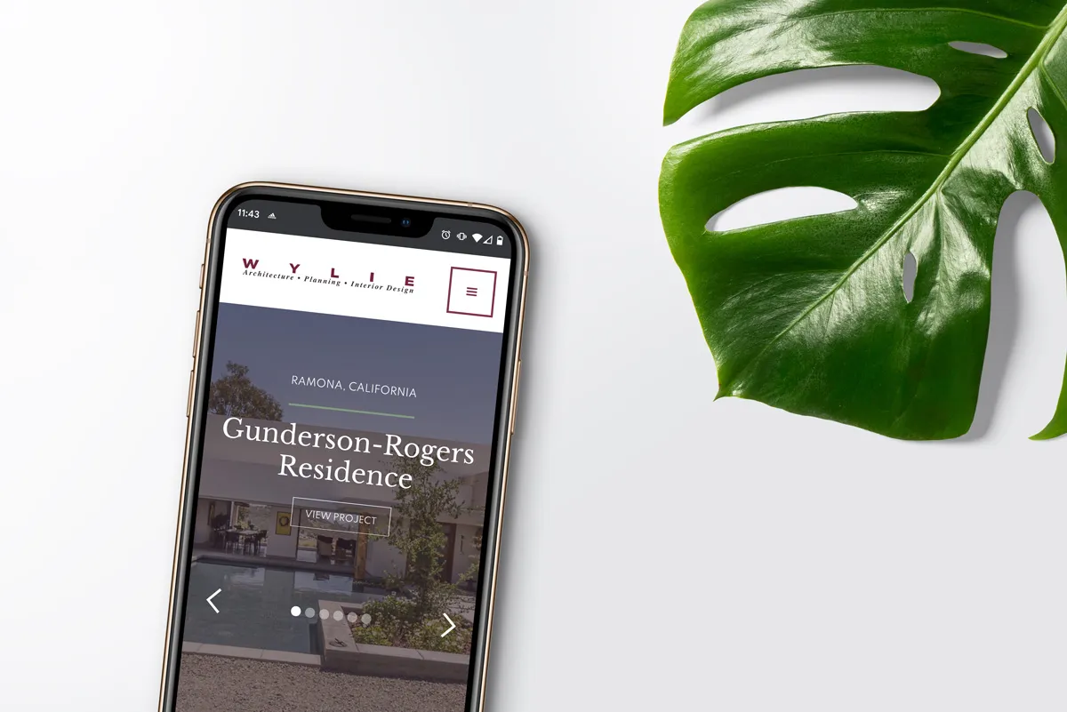
Carole Wylie established Wylie Architecture • Planning • Interior Design, Inc in 1990. She is a well-known architect and interior designer in Ramona, California, and the greater San Diego area. After having her WordPress site for many years, she soon discovered her website was not growing with her. It was outdated, not built for mobile devices, and was breaking due to old plugins. As a result, it was difficult for her to maintain and update. It was time for wyliearchitecture.com to have a design overhaul and go under construction.

"I hired Jessica to redesign my extremely outdated website for my architectural firm. Being an architect, it was very important to me to have an organized site but with an artistic flair. Jessica had fresh ideas that made my site so much better, while also being open to my thoughts and comments along the way. She is extremely easy to work with, efficient and responsive. I could not be happier with the process, but most importantly, I LOVE my new site!"
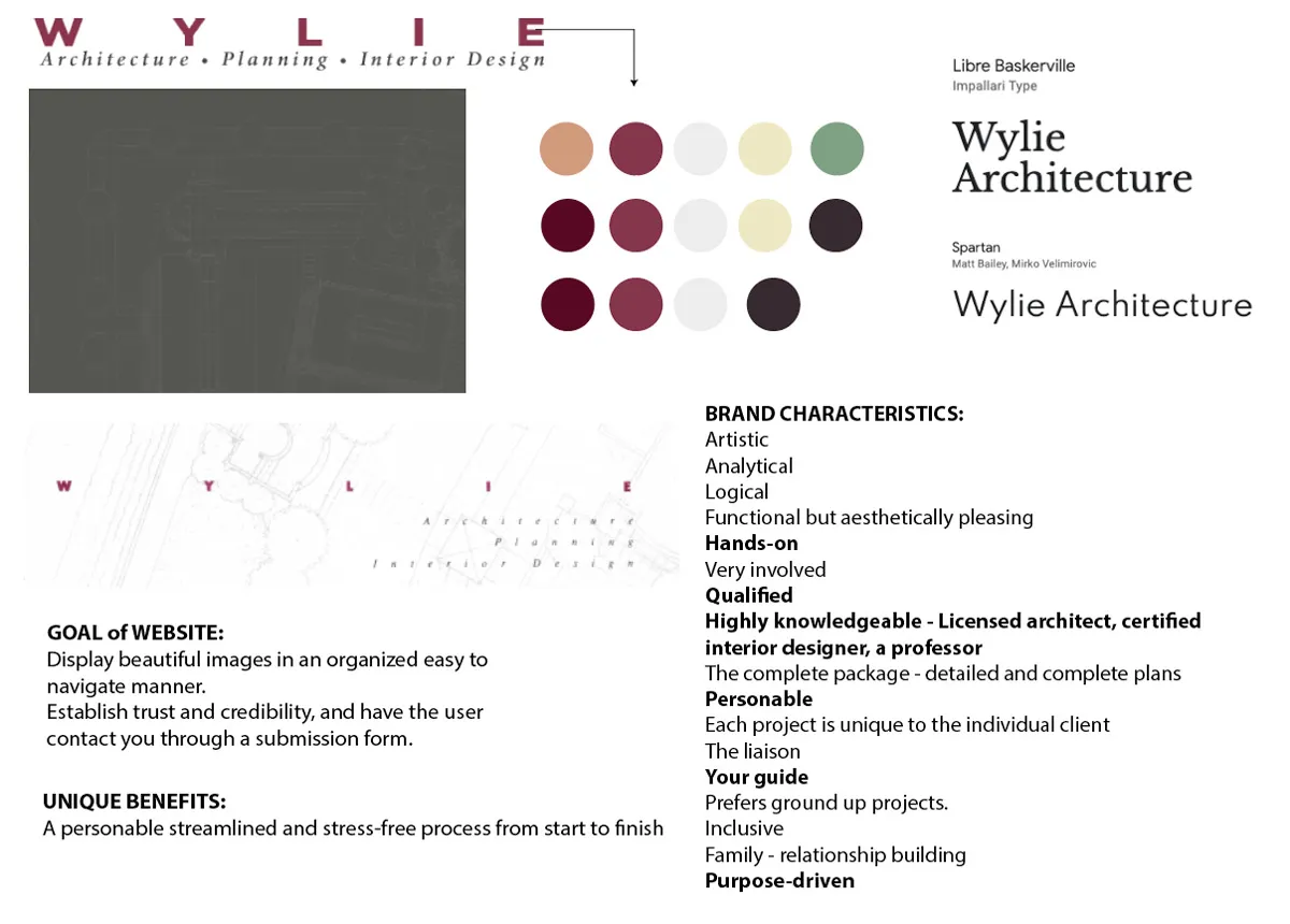
Since Wylie Architecture’s logo was well established, we agreed we wouldn’t touch the logo but instead use it as a starting point. The original site was very dark — nothing close to how Carole is as an individual and business woman.
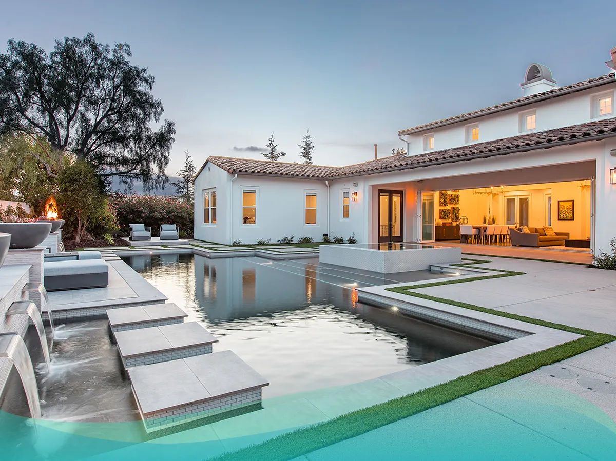
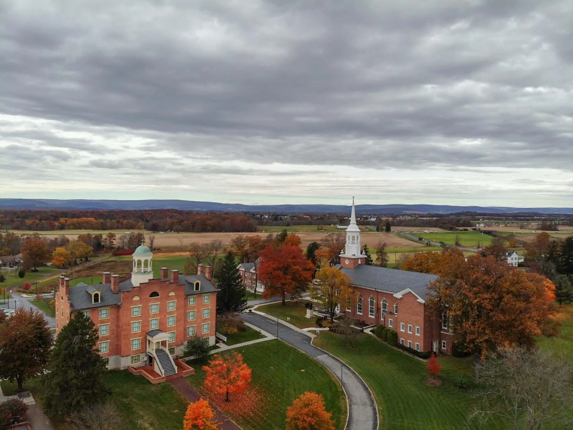
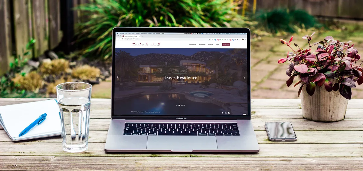
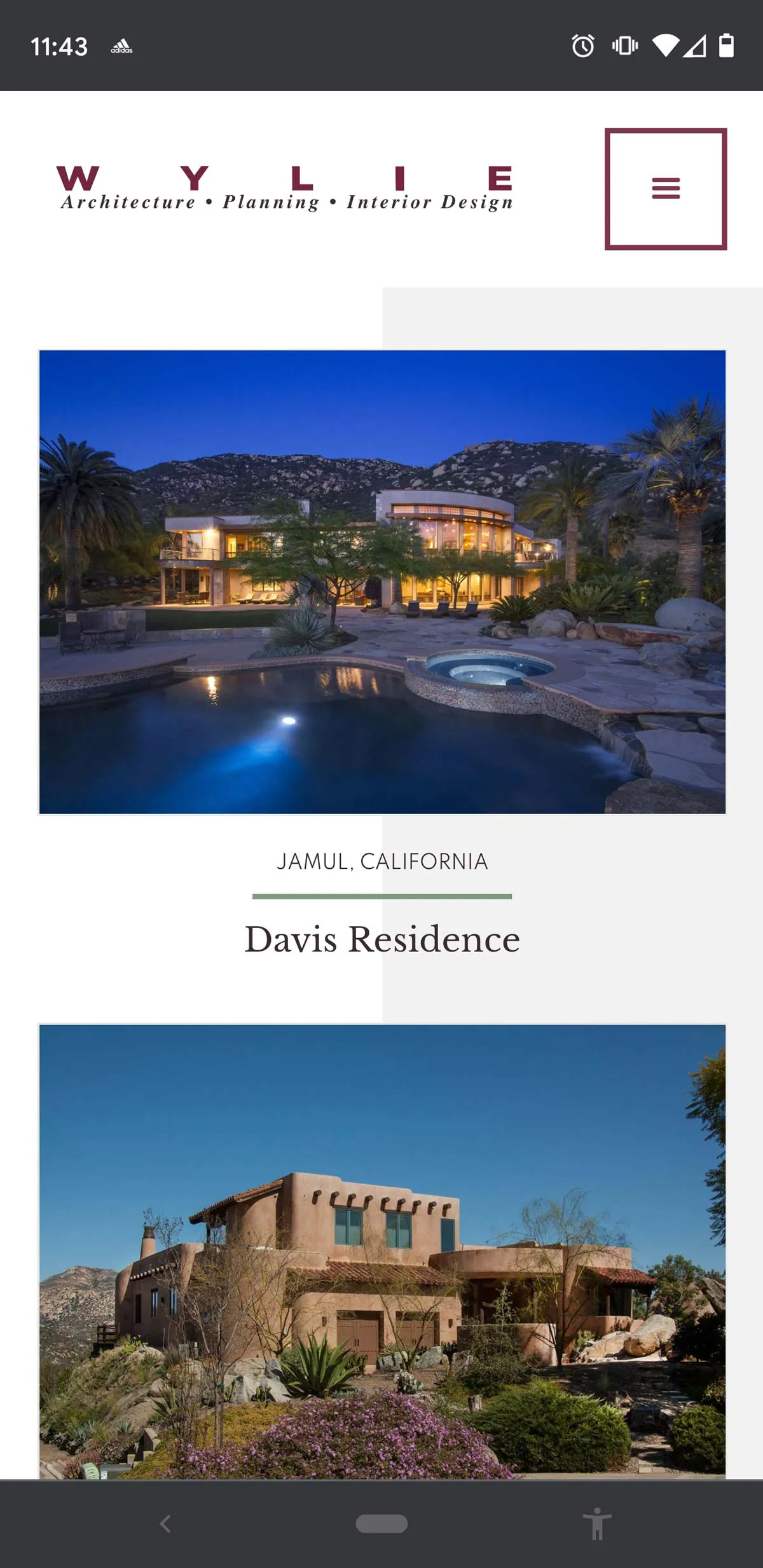
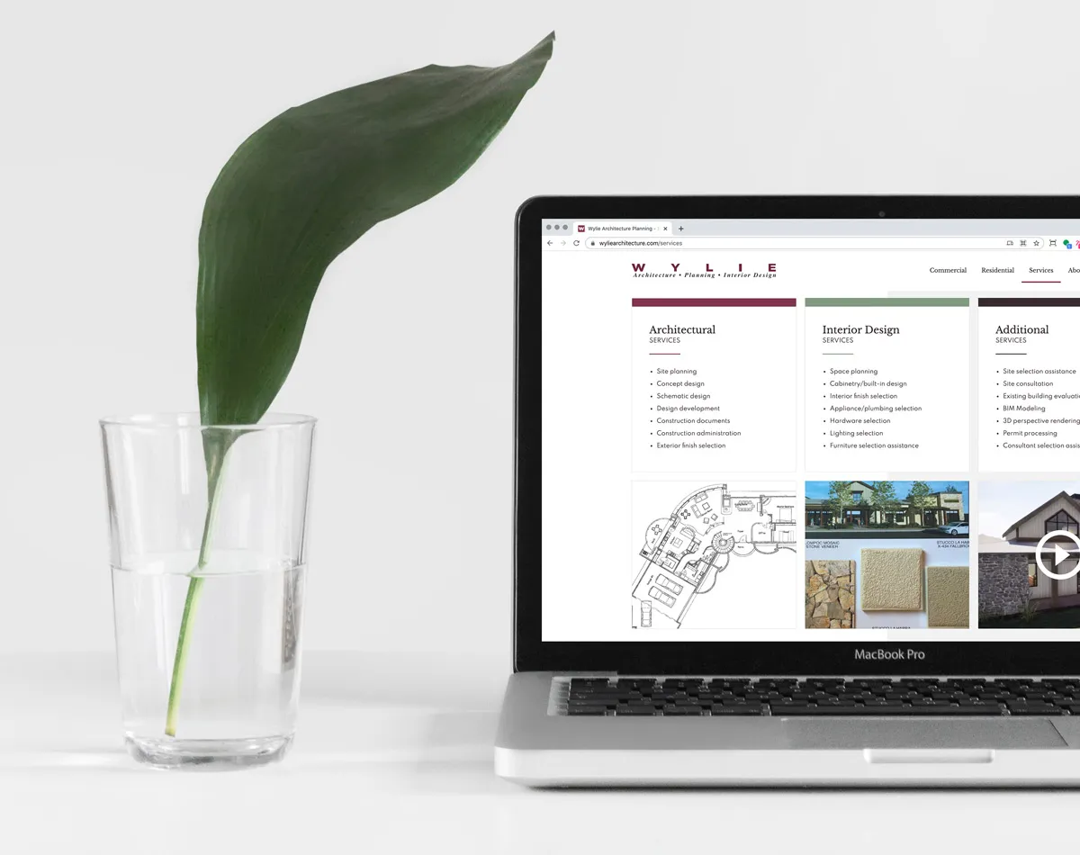
When you talk to Carole, you immediately know you’re dealing with a pro. She is personable, kind, creative, and all about function. So we made sure those characteristics were present within her website. We designed the site to be light and bright, adding white space so her project photos could be the focal point and shine! We took her branded plum color and expanded upon it by pairing it with a complimentary succulent-green and neutral grays.
Her site’s main goal was to have prospective clients contact her through her submission form. So the user flow of her site needed to be seamless from start to finish.
Since Carole is a busy business owner, We made sure her custom website was not only beautiful on the front-end but functional on the back-end. By understanding her pain points and her process of how she updates her projects, together, we created a back-end that was easy to use and easy to update. Her project pages were flexible and scalable, depending on what she wanted to showcase for each project.




.webp)
.webp)
