

The VIBE Movement
First established in 2016, The VIBE Movement was a program that helped troubled youths transform their frustrations into positive and independent solutions. This consulting firm helped schools, administrations, and youth programs develop internal procedures to counter the current zero-tolerance educational system.
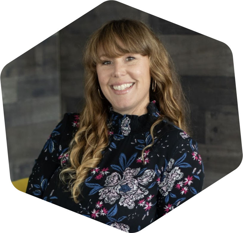
Being a new business back in 2016, the Founder and Lead Visionary, Tina Medina (she has such a cool name by the way), needed the necessary tools to establish herself as the expert. She saw a demand for her services, and she needed the means to pursue those prospective clients. The main goal was for her to stand out from her competitors in an authentic way that resonated with a younger crowd.
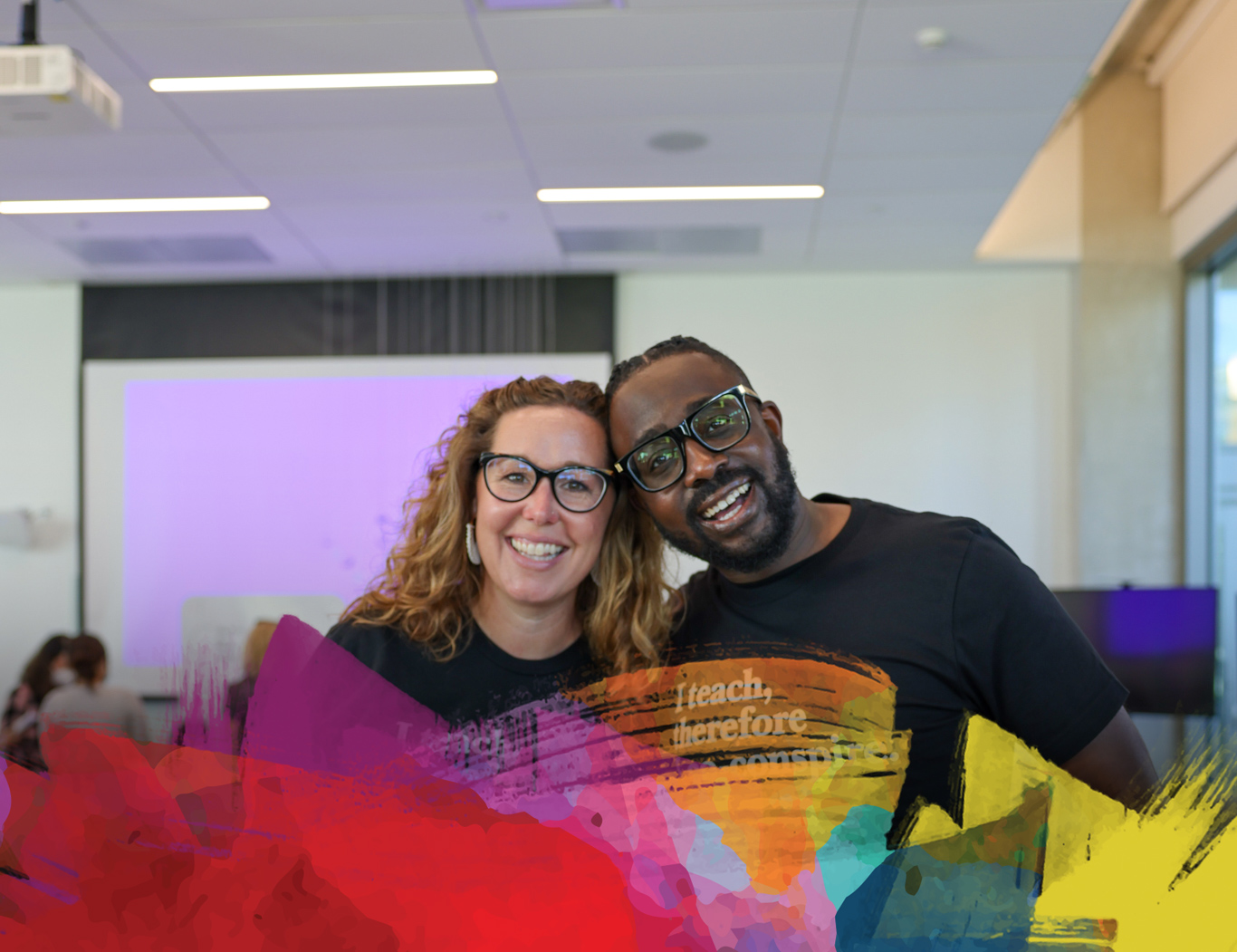
Fast forward to 2023, she started seeing great success in her business, and her business evolved into, “Co-conspiring with bold and ambitious educators.” Not only was she helping them professionally, but also personally. As a result, this caused a shift in her target audience. So rather than having a more youthful personality, The VIBE Movement needed a brand refresh that catered more to an older and sophisticated audience, that truly and authentically reflected who Tina was and what the VIBE Movement represented now and for many years to come.
"Every time I come to Jess with a new project, I’m blown away by her ingenuity, honesty and creativity. Because she’s such an amazing listener, she is able to craft exactly what I’m looking for, time and time again. She’s exceptional at designing the brand or product that perfectly captures what I’m wanting to put out into the world. Not only is it beautiful, fun and vibrant, but it’s functional and smart!"
For her identity in 2016, we wanted to not just capture a youthful spirit, but encompass who Tina was as a person. This woman would walk into a room, and you could immediately feel her positive vibrations. It was natural, down to earth, positive, and warm. We only thought it was appropriate to design a logo that was hand-rendered and colorful because it gave a tactile and human quality that was relatable and tangible. While all her other competitors were very flat and clean, her identity was everything Tina and the VIBE Movement stood for.
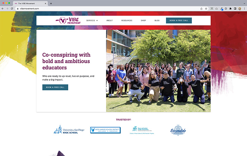
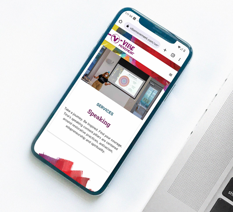
Then in 2023, we thought her website needed a new look. The content was perfect, the only thing that needed to be updated was the user experience and look/feel.
Her new ideal clients were educators who were burnt out and needed guidance. So the website needed to be relatable, easy to navigate, and effortless. She emphasized working with “bold educators," so we wanted to make the website bold as well. We offset that boldness by making the page layouts cleaner, minimal, and well organized. The content and user flow always directed the user to understand her expertise, promote her services, and to get them to sign up for a consultation.
Not only did we design her branding and website, we also created branded products and apparel.

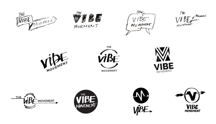


For her identity in 2016, we wanted to not just capture a youthful spirit, but encompass who Tina was as a person. This woman would walk into a room, and you could immediately feel her positive vibrations. It was natural, down to earth, positive, and warm. We only thought it was appropriate to design a logo that was hand-rendered and colorful because it gave a tactile and human quality that was relatable and tangible. While all her other competitors were very flat and clean, her identity was everything Tina and the VIBE Movement stood for.
Then in 2023, we thought her website needed a new look. The content was perfect, the only thing that needed to be updated was the user experience and look/feel.
Her new ideal clients were educators who were burnt out and needed guidance. So the website needed to be relatable, easy to navigate, and effortless. She emphasized working with “bold educators," so we wanted to make the website bold as well. We offset that boldness by making the page layouts cleaner, minimal, and well organized. The content and user flow always directed the user to understand her expertise, promote her services, and to get them to sign up for a consultation.
Not only did we design her branding and website, we also created branded products and apparel.


.png)
.png)
.png)